
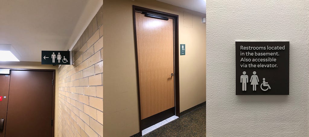
Inside Sterling Memorial Library, through a door in the corner of the CTL, down a set of stairs, through another door, around a corner, and through (you guessed it) another door, lies a rarely used bathroom. I have never seen anyone down there (probably because it’s so fucking hard to get to). In fact, I would contend that it is the least used bathroom on campus. It is also the worst (men’s) bathroom at this entire university.
Here’s why.
First of all, it’s huge. Like, comically big. When I’m in there by myself it’s a little spooky (which, again, has never not been the case because of its aforementioned distance from civilization). For a space that contains three toilets and three urinals, this bathroom is immensely long. It takes a good five steps to even see the toilets. And once you reach them, the fun really begins.
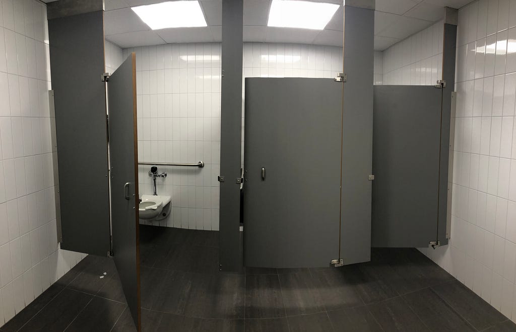
Three stalls line the wall in the back-right corner of the bright white-tiled room, each of which exhibits a horrendous mistake, generally with regard to the door of the stall. Starting with the far-right stall, there is no handle on the inside of the door — it’s simply missing. Crucially, the door is not configured such that you can push it to exit the stall after having done your business: it’s a pull door. To get out, you have two options: either grab the coat hanger or grip the nub on the lock. And once you make your decision, be prepared to straddle the toilet so there’s actually clearance for the door to open.
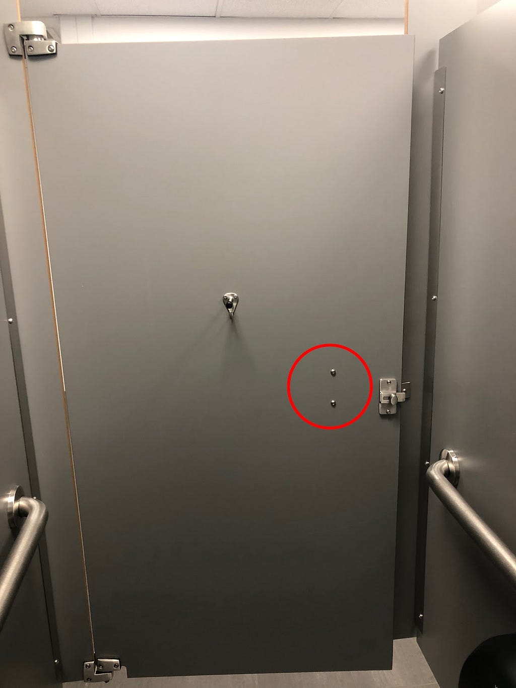
Moving one stall to the left, the opposite problem presents itself: the door has a handle but is meant to be pushed open. This is a classic example of a “Norman door,” a door that misleads the user as to how to actually open it. “Yes. I push doors that are meant to be pulled, pull doors that should be pushed, and walk into doors that neither pull nor push, but slide… My problems with doors have become so well known that confusing doors are often called ‘Norman doors,’” design critic Don Norman lamented in his seminal book, The Design of Everyday Things.
Even more curiously, why is there a discrepancy between the two stalls described so far? They are identical beyond the fact that one has a missing handle on the inside and the other has an extra handle on the outside. How could such contrasting errors have been made during the construction of this bathroom?
The third stall, situated at the far left, is the crown jewel, the epitome, the magnum opus of this entire disaster. From the outside, there seems to be no problem: there’s a handle correctly mounted on the exterior of the wide door to the “wheelchair accessible” stall. But the other side of the sad, gray panel tells a different story. The handle is attached to the wrong edge of the door, on the side with the hinge.
Here is where I can flex my high school physics knowledge: work equals force times distance. This means placing the handle so close to the hinge (i.e. a short distance) requires significantly more effort to close the door. I’m positive everyone could intuit this, but I just want to emphasize how egregious this mistake is.
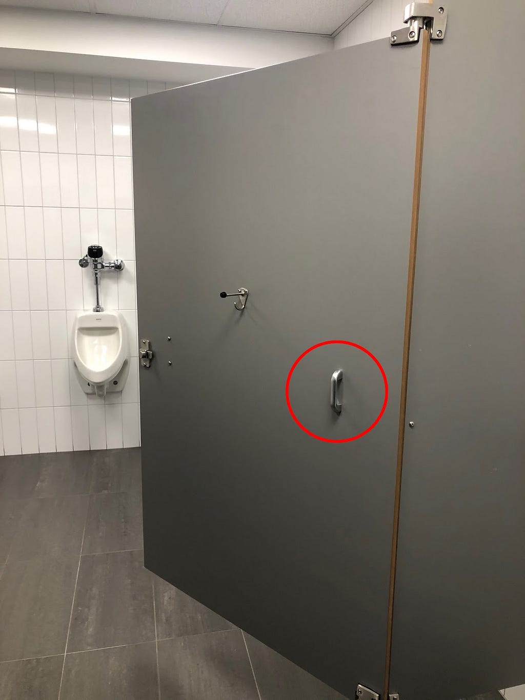
The handle placement does not only cause inconvenience, but it violates Standards for Accessible Design under section II and III of the Americans with Disabilities Act (ADA). Section 604.8.1.2 of the ADA guidelines stipulates that a door handle “shall be placed on both sides of the door near the latch.” The handle pictured is most certainly not “near the latch.” I was not able to measure the force required to open the door, but it seems plausible that this stall is also in violation of 309.4: “Operable parts [e.g. door handles] shall be operable with one hand and shall not require tight grasping, pinching, or twisting of the wrist. The force required to activate operable parts shall be 5 pounds (22.2 N) maximum.” If you weren’t convinced by my earlier examples, how’s this: the first two stalls were bad, but this one’s illegal.
With so much of Yale already inaccessible, it is unacceptable that such a recently renovated space does not abide by either the ADA’s Standards for Accessible Design nor My Standards for Common Sense. All the mistakes I’ve noted could have been easily avoided; they appear to be careless construction errors, not some perplexing design problem left unsolved. A little bit of sensibility in the assembly of the stalls may have been the only thing required to save this bathroom from peril.
Good design is intuitive and simple — you just have to give a shit.

Designed for Shits: Lessons from the Worst Bathroom in all the Land was originally published in The Yale Herald on Medium, where people are continuing the conversation by highlighting and responding to this story.